ABAS ERP Redesign: Avega Bros. Integrated Shipping Corporation
Redesigning a legacy ERP used daily by 100+ employees at a 40-year-old Philippine logistics company.
Overview
ABAS (AVega Business Automation System) is the internal ERP platform used daily by 100+ employees at Avega Bros., a Philippine shipping and logistics company with 40+ years of operations. The system manages everything from HR and attendance tracking to recruitment, crew movements, payroll, and employee relations. When I joined the project, ABAS was functional but deeply outdated, built on legacy UI patterns that made it difficult to navigate, hard to learn, and slow to use. Employees routinely bypassed the system in favor of spreadsheets.
Role
Lead Product Designer: led the full redesign of the HR module, built a design system from scratch, and established a scalable design framework for future modules, while managing design interns and running iterative design reviews with stakeholders.
Team
Design Lead + Design Interns + Developers + Stakeholders
Timeline
Ongoing (2026-Present)
Platform
Desktop Web Application
Client
Avega Bros. Integrated Shipping Corporation
Tech Stack
Case Study
The Problem
ABAS served a critical function, it was the operational backbone for managing 100+ employees across multiple departments and vessel crews. But the interface hadn't evolved with the company's needs. Through employee interviews and a heuristic evaluation of the existing system, I identified three categories of problems.
Research & Discovery
Employee Interviews
I conducted interviews with employees across roles and departments to understand how they actually used ABAS day-to-day. I transcribed every session, broke each transcript into individual observations and quotes, then clustered them on a board. Four themes surfaced again and again, and almost all of them traced back to a single behavior: people had quietly moved their real work out of ABAS and into spreadsheets.
“I just use Sheets instead”
ABAS wasn't the system of record, personal spreadsheets were.
Honestly? I keep my own Excel file. It's faster than opening ABAS.
Our team's leave tracker lives in one Google Sheet, that's the real source of truth, not the system.
When payroll needs numbers, I export to Excel and fix everything there anyway.
I built my sheet years ago and I've never stopped using it.
“I can never find anything”
25+ flat menu items + weak search = users gave up navigating.
I type a name into search and half the time nothing comes up.
Search only works if you spell it exactly how they encoded it.
There are 25 things in the sidebar, I can never remember which one I need.
For anything I don't do every day, I just give up and ask a colleague.
“Building a table takes forever”
Getting a clean, filtered list out of ABAS was slower than rebuilding it by hand.
Pulling a clean list out of ABAS takes me half an hour. In Sheets it's two minutes.
I can't sort or filter the way I need, so I copy it all out and do it myself.
Making a simple report means re-typing everything into a table by hand.
The masterlist is 10 columns of everything, I only ever need three.
“I don't trust it, so I keep my own copy”
Confusion bred low confidence; people defaulted to what they could control.
I'm never sure what's in there is up to date, so I keep my own copy.
It feels like one wrong click and I've broken something.
New hires take weeks before they'll touch ABAS on their own.
Why rely on the website when my sheet has never failed me?
Heuristic Evaluation
To complement the interviews, I audited the existing ABAS interface against Nielsen's 10 usability heuristics, walking through the core HR screens (sidebar, Employee Masterlist, Leave Applications) and rating each violation on Nielsen's 0–4 severity scale. The audit gave the spreadsheet workarounds a concrete cause: the system was working against the heuristics that make software learnable and efficient.
| Heuristic | Issue identified | Severity | Recommendation |
|---|---|---|---|
| Recognition rather than recall | The flat sidebar lists 25+ uncategorized items, forcing users to memorize which one maps to each task. No grouping, no meaningful icons, and no breadcrumbs to show where they are. | 4 · Catastrophic | Group items into collapsible categories, add a breadcrumb trail, and use recognizable section icons. |
| Aesthetic and minimalist design | The Employee Masterlist renders a 10-column table across 3,854 rows, and Leave Applications devotes half the viewport to an always-expanded filter panel before any data loads. | 3 · Major | Prioritize columns by task, collapse advanced filters behind progressive disclosure, and surface results first. |
| Visibility of system status | Approval workflows (leave, OT, OB) give no feedback after submission, employees can't see where a request sits in the pipeline or who needs to act next. | 3 · Major | Add a clear status indicator (Pending → Approved / Rejected) and a timestamped activity trail on each request. |
| Consistency and standards | Button styling is inconsistent (green "Add" vs. gray "Back"), sidebar spacing is uneven, and there is no unified color system across screens. | 3 · Major | Establish a design system with tokenized colors, spacing, and a standardized button hierarchy. |
| Flexibility and efficiency of use | There are no accelerators for frequent tasks. The Quick Access search exists but is buried, and there are no recents, favorites, or saved filters for power users. | 3 · Major | Promote global search, add saved views and favorites, and provide bulk actions for repeat workflows. |
| Match between system and the real world | Labels mirror database fields ("Sub-sections", "Leave Credit Codes") rather than the language employees actually use to describe their work. | 2 · Minor | Rename entries to task-oriented, human language grouped around real workflows. |
| Help users recognize, diagnose, and recover from errors | Empty states like "No matching records found" give no cause or next step, and form errors aren't tied to the field that triggered them. | 2 · Minor | Write actionable empty and error states ("No results, try clearing filters") with inline, field-level validation. |
Ideation & Design Decisions
Information Architecture Overhaul
The most impactful change was restructuring the entire navigation. I consolidated 25+ flat sidebar items into 13 grouped categories with collapsible sub-menus.
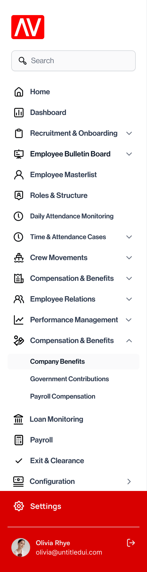
The core principle: related data should live together. Positions, Departments, Divisions, and Org Chart are all facets of the same concept, organizational structure. They don't need four sidebar items; they need one page with four tabs.
Tab-Based Sub-Navigation
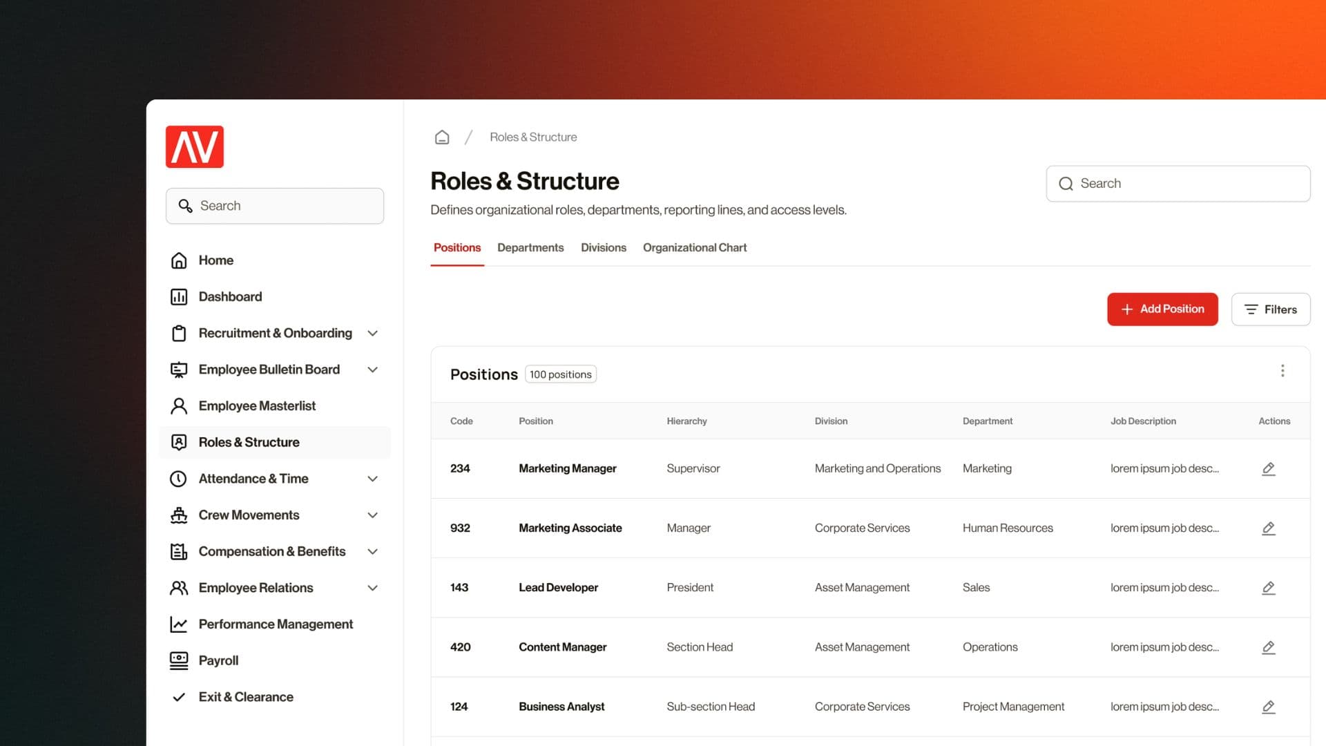
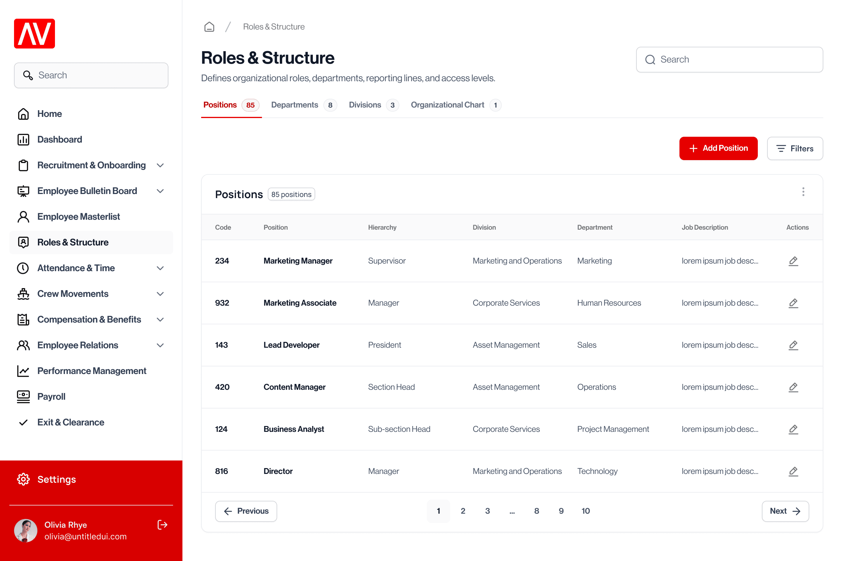
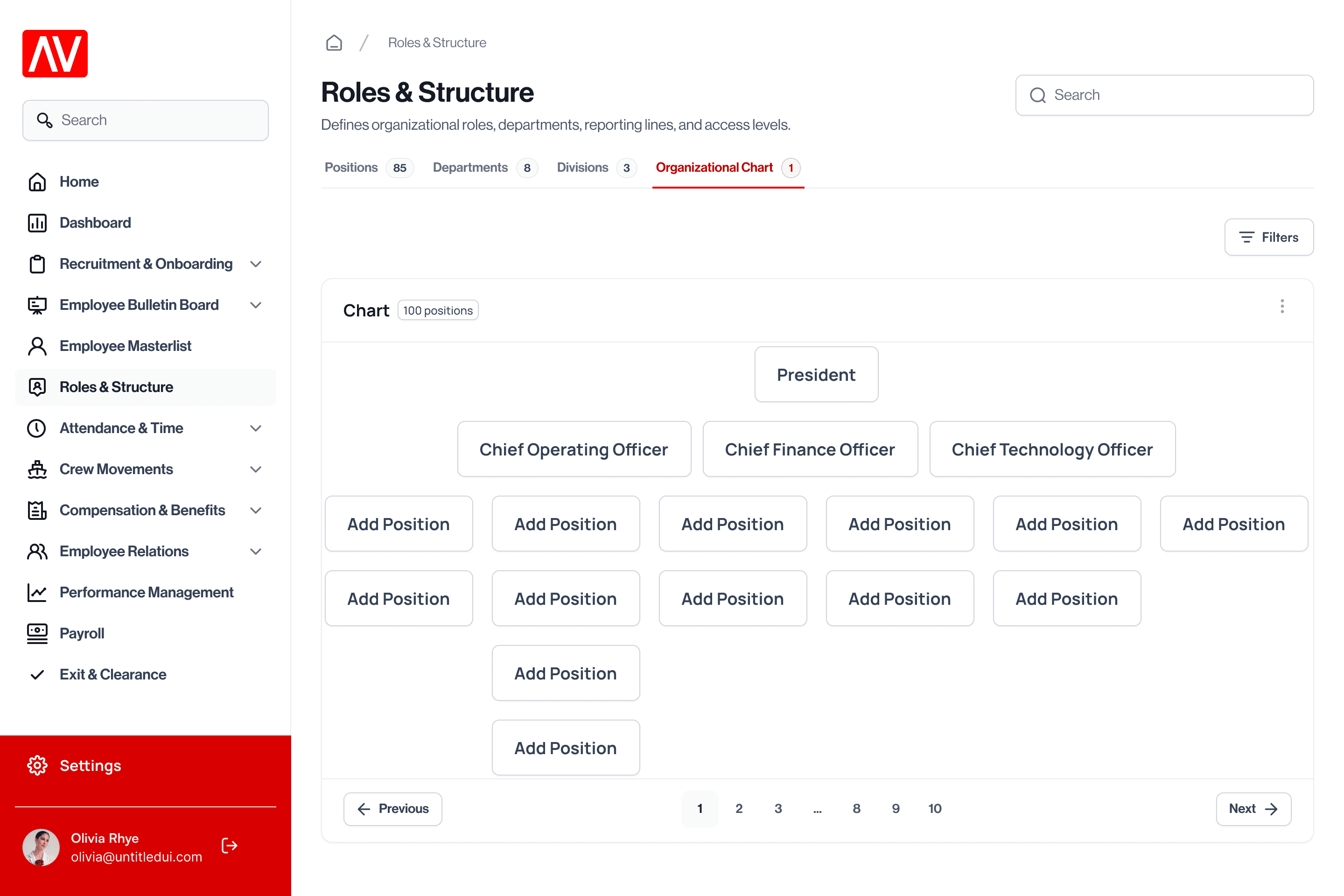
Instead of scattering related content across separate pages, I introduced horizontal tab bars within pages. The Roles & Structure page now has tabs for Positions, Departments, Divisions, and Organizational Chart, all accessible without leaving the page or losing context. Each tab shows a count badge so users can see the scope at a glance.
Roles & Structure
Defines organizational roles, departments, reporting lines, and access levels.
Positions
85 positions| Code | Position | Hierarchy | Division | Department | Actions |
|---|---|---|---|---|---|
| 234 | Marketing Manager | Supervisor | Marketing and Operations | Marketing | |
| 932 | Marketing Associate | Manager | Corporate Services | Human Resources | |
| 143 | Lead Developer | President | Asset Management | Sales | |
| 420 | Content Manager | Section Head | Asset Management | Operations | |
| 124 | Business Analyst | Sub-section Head | Corporate Services | Project Management | |
| 816 | Director | Manager | Marketing and Operations | Technology |
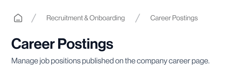
Breadcrumb Navigation
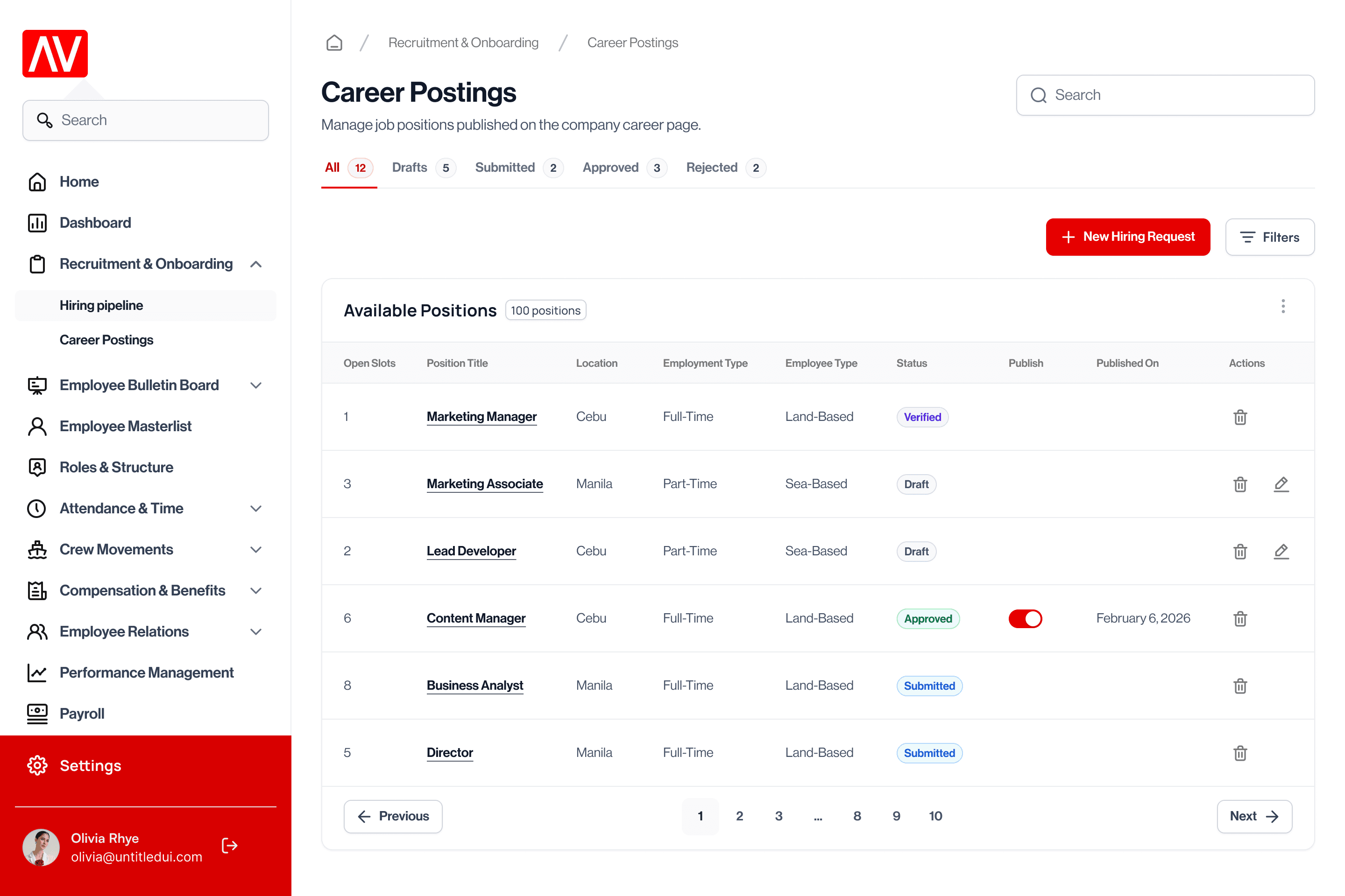
Every page now includes a breadcrumb trail (e.g., Home → Recruitment & Onboarding → Career Postings) so users always know where they are in the system and can navigate upward without relying solely on the sidebar.
Status-Filtered Tabs with Counts
For workflow-heavy pages like Career Postings and Hiring Pipeline, I added status tabs with real-time counts (All 12 · Drafts 5 · Submitted 2 · Approved 3 · Rejected 2). This eliminates the need for a separate filter panel for the most common filtering action, checking items by status, and gives managers an instant overview of their pipeline without any clicks.
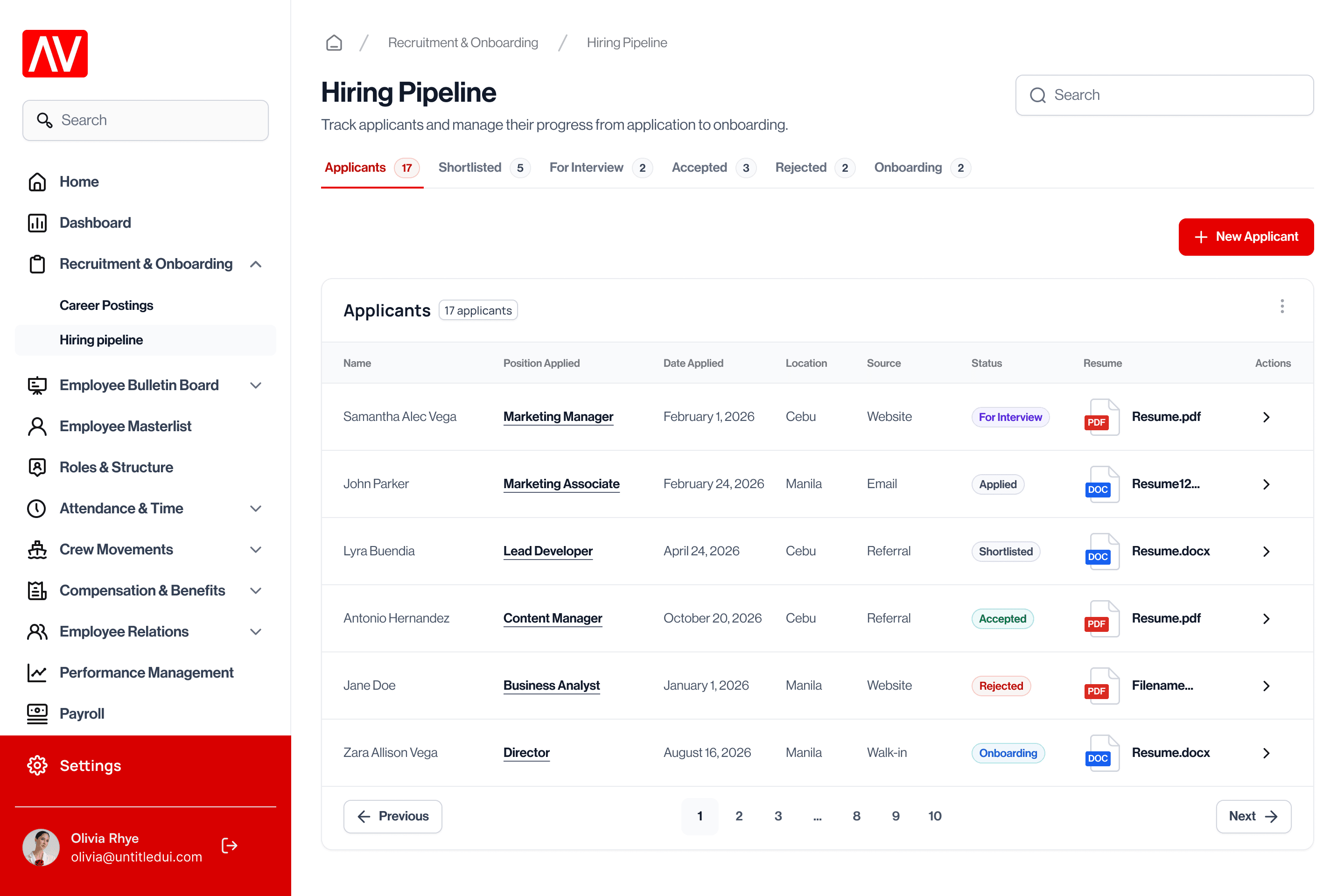
Hiring Pipeline
Track applicants and manage their progress from application to onboarding.
Applicants
17 applicants| Name | Position Applied | Date Applied | Location | Source | Status | Resume | Actions |
|---|---|---|---|---|---|---|---|
| John Parker | Marketing Associate | February 24, 2026 | Manila | Applied | DOCResume12… | › | |
| Miguel Santos | Sales Officer | March 5, 2026 | Cebu | Website | Applied | PDFResume.pdf | › |
| Ella Rivera | HR Assistant | March 18, 2026 | Davao | Website | Applied | DOCXResume.docx | › |
| Lyra Buendia | Lead Developer | April 24, 2026 | Cebu | Referral | Shortlisted | DOCXResume.docx | › |
| Noah Cruz | Project Coordinator | April 2, 2026 | Manila | Referral | Shortlisted | PDFResume.pdf | › |
| Maya Reyes | UX Designer | May 11, 2026 | Cebu | Website | Shortlisted | DOCXResume.docx | › |
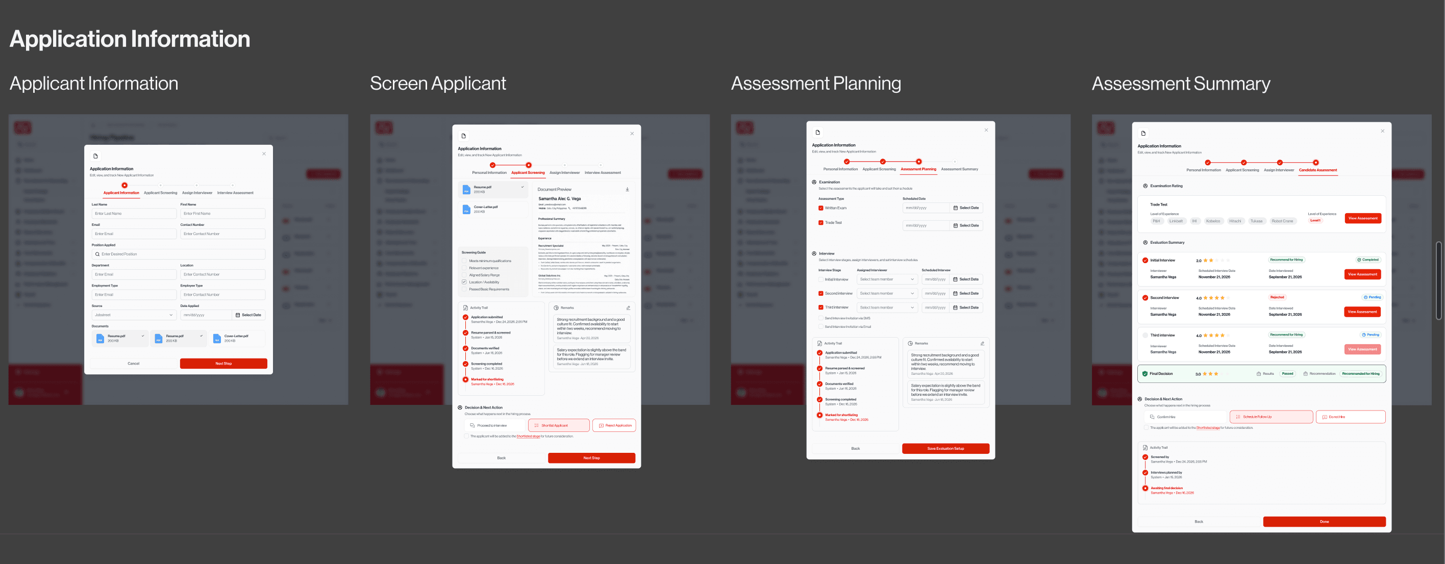
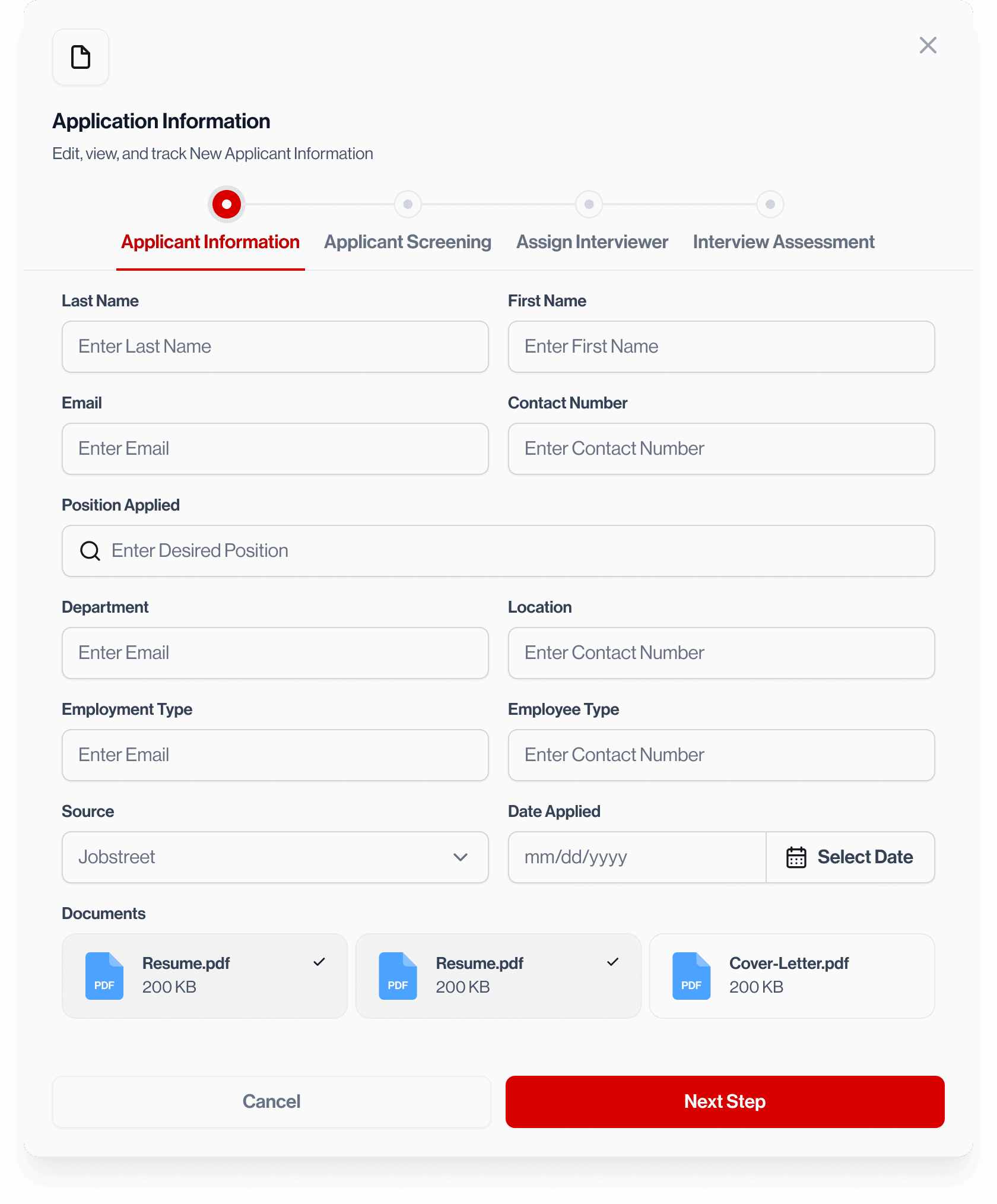
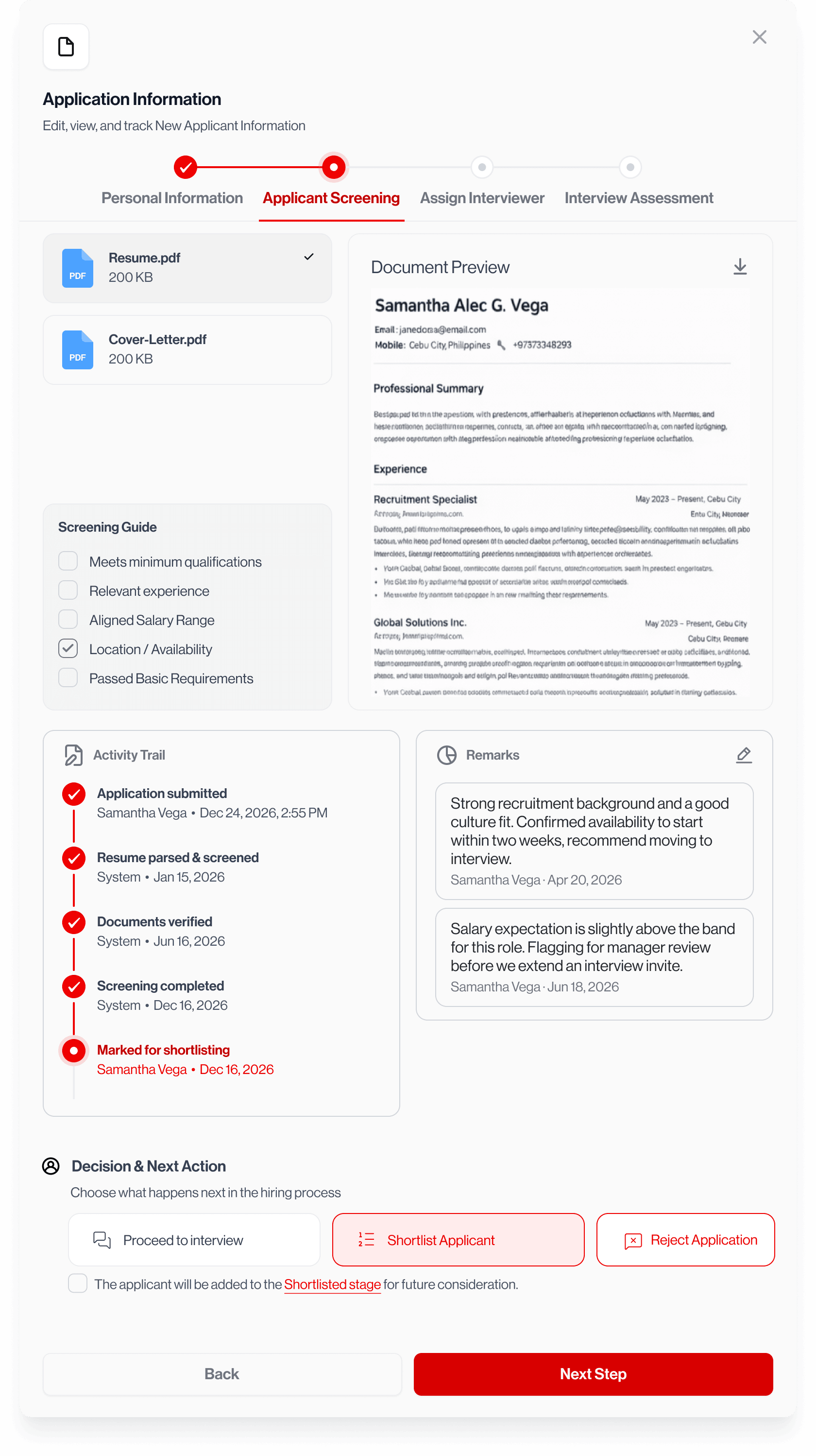
Multi-Step Modal Wizards
The old system had no structured workflow for complex processes like hiring. I designed a 4-step wizard for the hiring pipeline, with a progress indicator, clear step labels, and a persistent activity trail so the hiring manager can see who took what action and when.
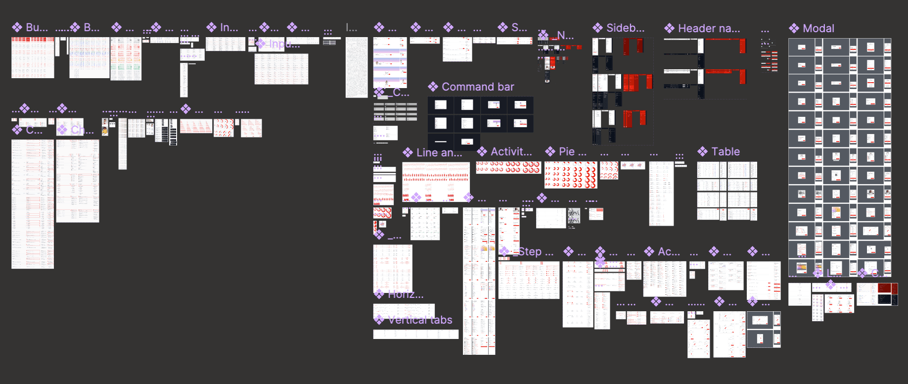
Consistent Design System
I built the design system from scratch, establishing four pillars that every module now inherits.
Final Design & Key Screens
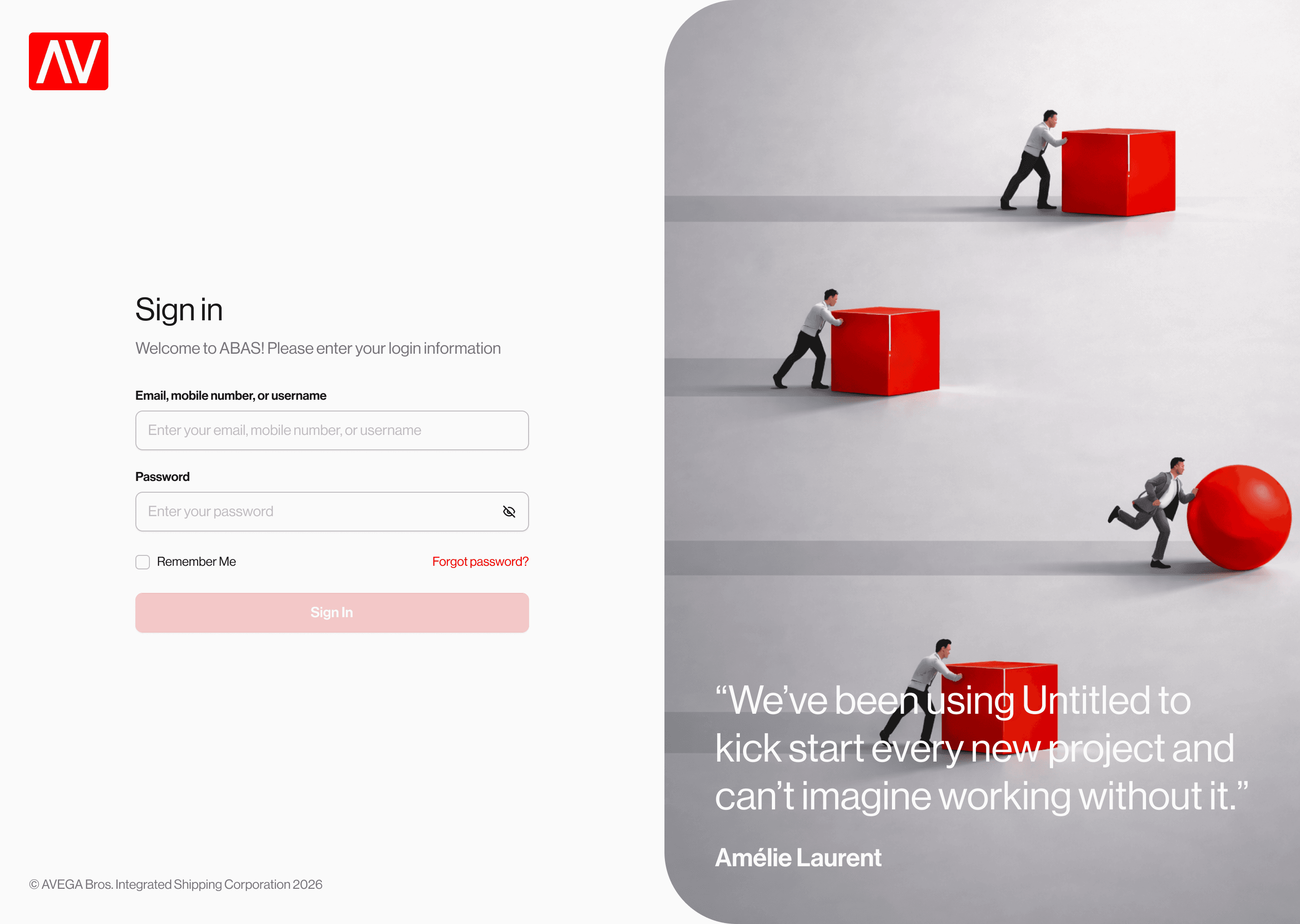
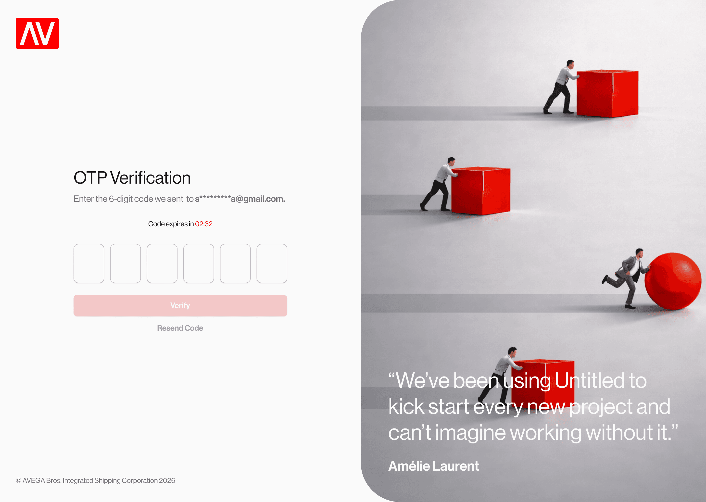
Authentication Flow
A branded login experience with the Avega "AV" logo, OTP verification with clear 6-digit input fields, and a forgot password flow. The right panel features brand imagery that reinforces the company identity from the first interaction.
Roles & Structure
A single page with four tabs replacing what was previously four separate sidebar items. The Positions tab displays a clean 6-column table with hierarchy and department context. The Org Chart tab visualizes reporting structure with interactive "Add Position" placeholders for building out the hierarchy.
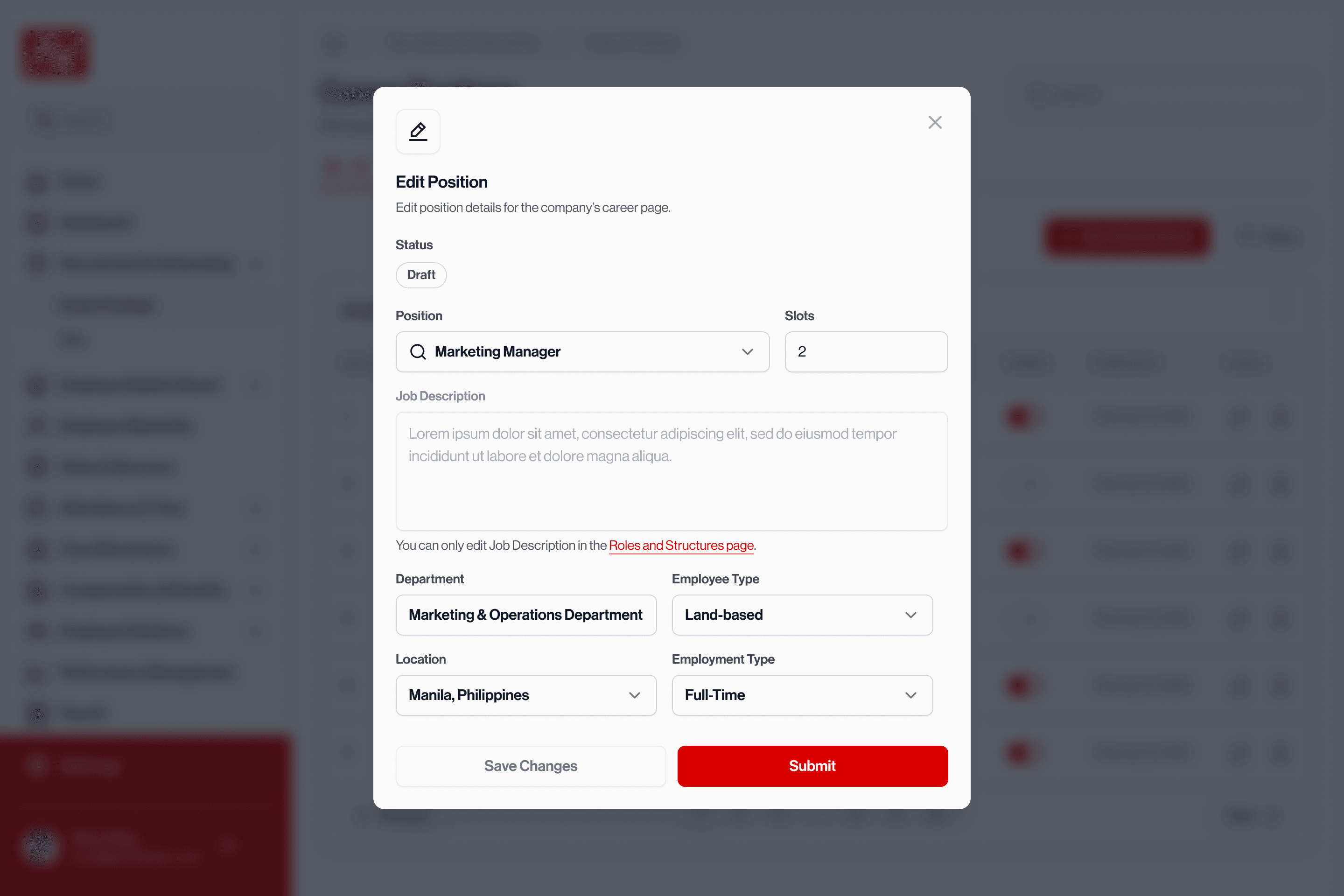
Career Postings
A recruitment management view with status-filtered tabs showing counts, a publish toggle for live postings, and an "Edit Position" modal for quick updates without leaving the page.
Hiring Pipeline
The most complex flow: an applicant tracking system with status-filtered tabs (Applicants 17 · Shortlisted 5 · For Interview 2 · Accepted 3 · Rejected 2 · Onboarding 2), inline resume file icons, and a 4-step wizard for progressing candidates through screening, assessment planning, and final evaluation.
Current Status
🟡 This project is ongoing. The HR module redesign is in testing and partial rollout. Results, impact metrics, and a full retrospective will be added once the redesigned system has been in use across the organization.
What's been delivered so far
My role & contributions
What's next