Timothy Grant Jewelry: Website Redesign & Visual Identity Refresh
Rebuilding a family jeweler's digital presence to match the quality of their craftsmanship.
Overview
A full end-to-end website redesign for Timothy Grant Jewelry, a family-owned boutique jeweler with two Illinois locations specializing in award-winning custom jewelry, fine jewelry, and expert services. I led competitive research, persona development, IA restructuring, visual identity creation, and high-fidelity design across a 6-page responsive web system.
Role
Lead UX Designer: led competitive research, persona development, information architecture, visual identity, and high-fidelity design across a 6-page responsive web system.
Team
Leigh Arriane Buendia, Pamela Olalia, Dani Guerrero
Timeline
3-4 weeks
Platform
Responsive web (desktop-first, mobile-optimized)
Tech Stack
Case Study
The Problem
The existing Timothy Grant website felt dated and minimal. The homepage showed a single product image on a white background, no value proposition, no calls to action, and no indication of the full range of services the business offered.
The business needed a refreshed, user-focused website that would establish credibility, surface its full value proposition, and convert browsers into consultation bookings and store visits.
Research & Discovery
I conducted structured research across three areas: a competitive audit of local jewelers, persona development based on business goals, and information architecture restructuring to align the site with user behavior.
Competitive Analysis
I audited two direct local competitors: Studio D Jewelers and Rahl Jewelers, across six dimensions: visual design and branding, navigation and IA, content and messaging, service presentation, technical performance, and engagement and conversion.
Key competitive opportunities
User Personas
I developed three personas representing Timothy Grant's core customer segments. Each maps directly to a primary page and user flow in the redesigned site.
Information Architecture
Using insights from the competitive audit and persona scenarios, I restructured the site's navigation from a 5-page flat layout to a more intentional 6-page hierarchy, with a new Wishlist feature ensuring every persona had a clear entry point from the homepage.
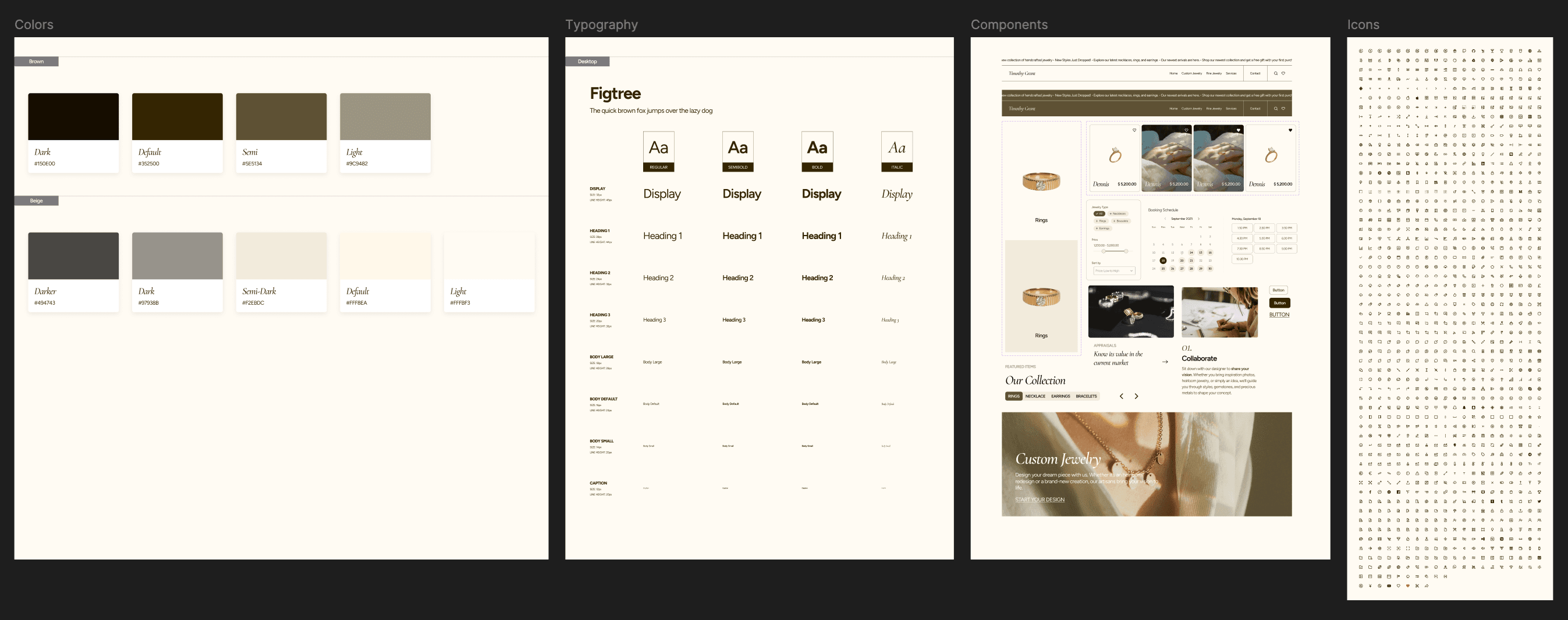
Ideation & Design System
Before diving into page layouts, I developed a cohesive visual identity system, colors, typography, logo, and components, to ensure consistency across all pages and give the team a shared foundation for high-fidelity design.
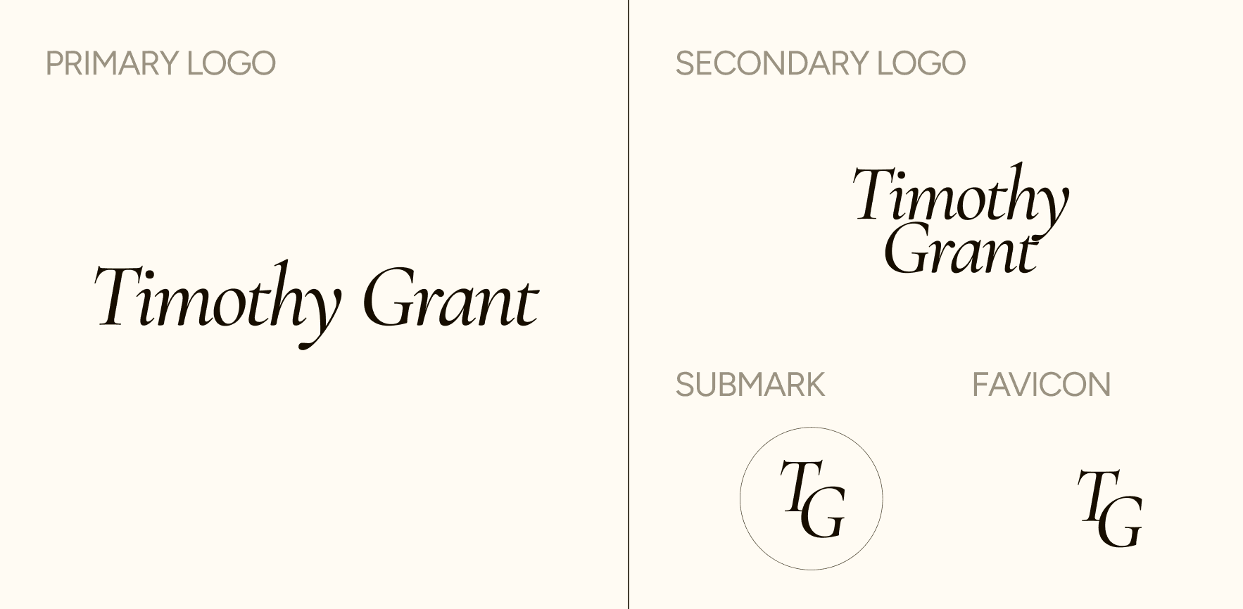
Visual Identity
The original branding used a casual handwritten script on a white background with no supporting visual system. The redesigned identity communicates luxury, warmth, and approachability, premium without feeling cold or exclusive. The warm, earthy palette is a deliberate departure from the black-and-white or navy-and-gold palettes common in luxury jewelry, evoking the warmth of gold and handcraftsmanship central to Timothy Grant's brand story.
Component Library
Components were built and documented in Figma before page design began, ensuring consistent patterns across the full site.
Final Design
The redesign spans 6 pages plus a wishlist feature, each built around a specific persona's journey. Every page was designed desktop-first with mobile-optimized counterparts.
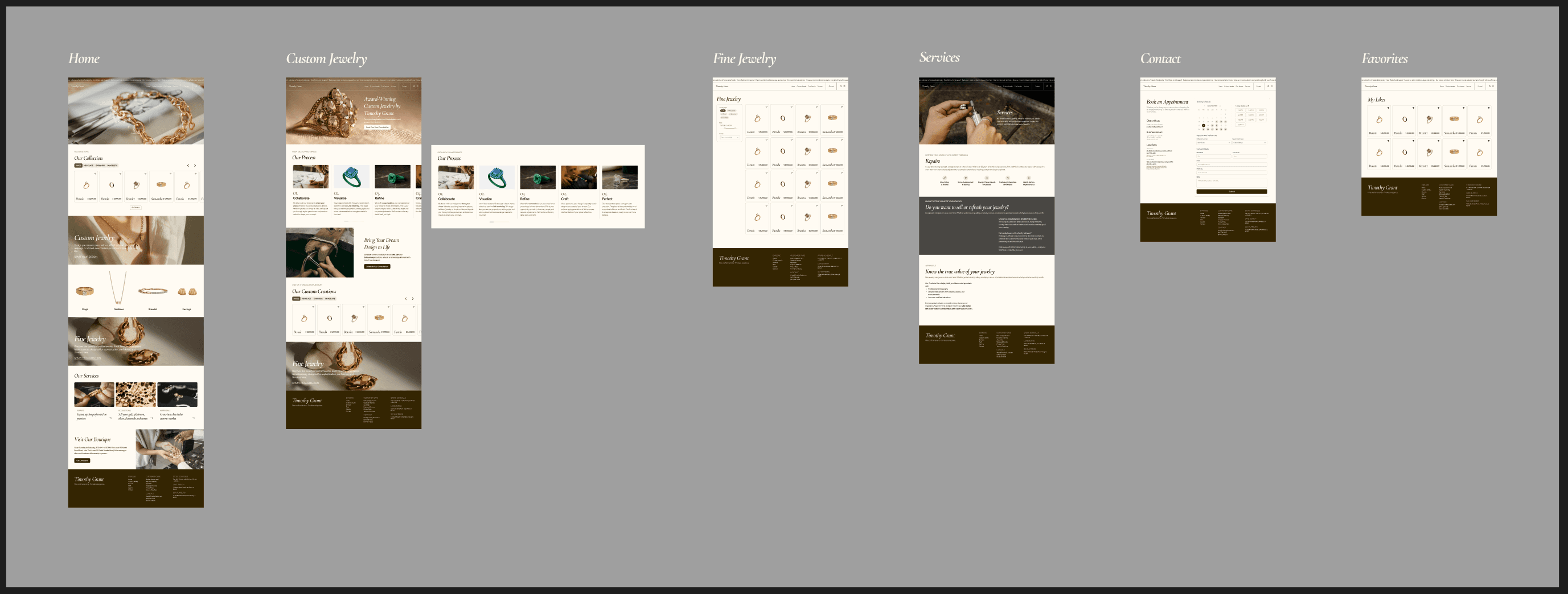
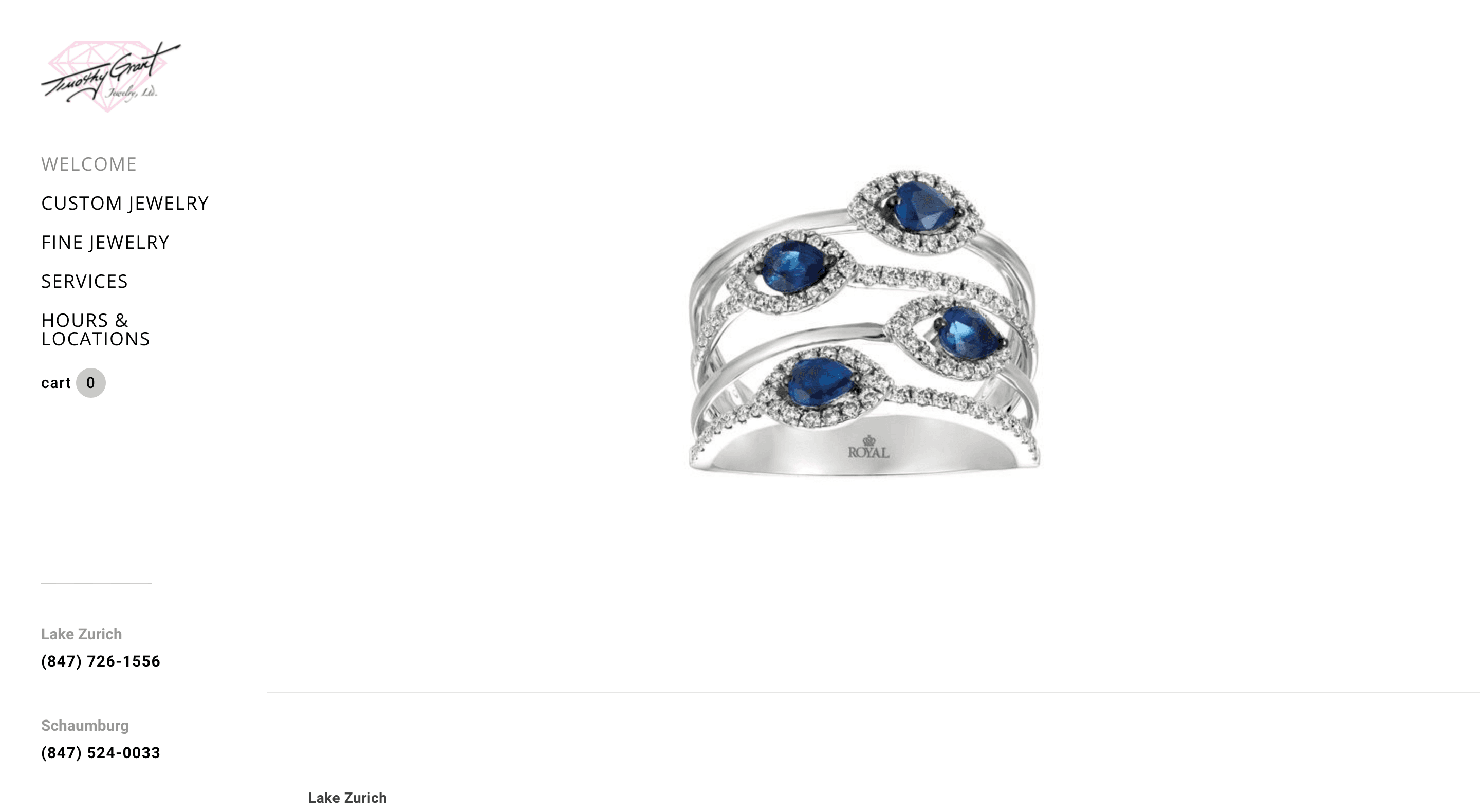
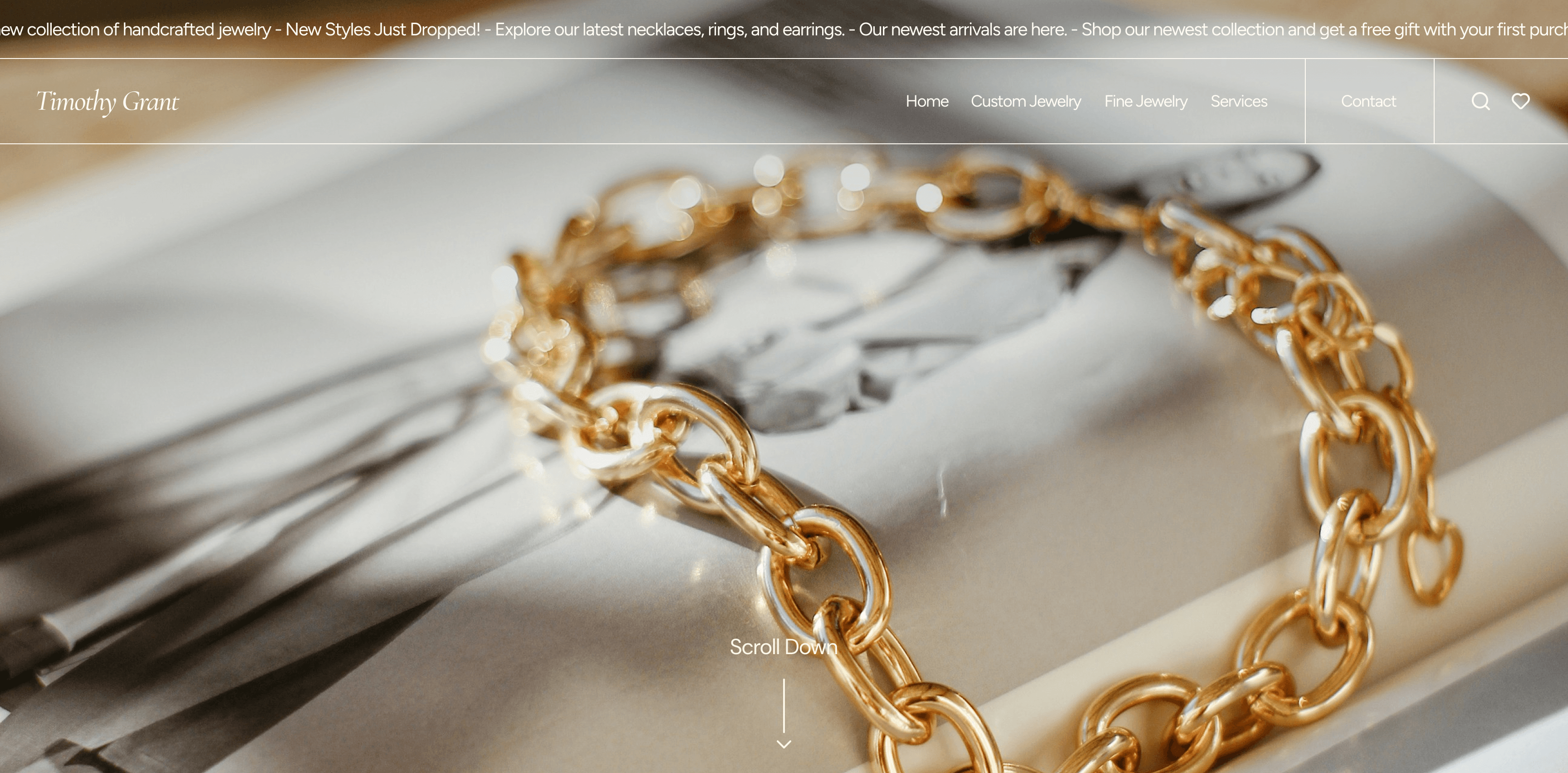
Homepage
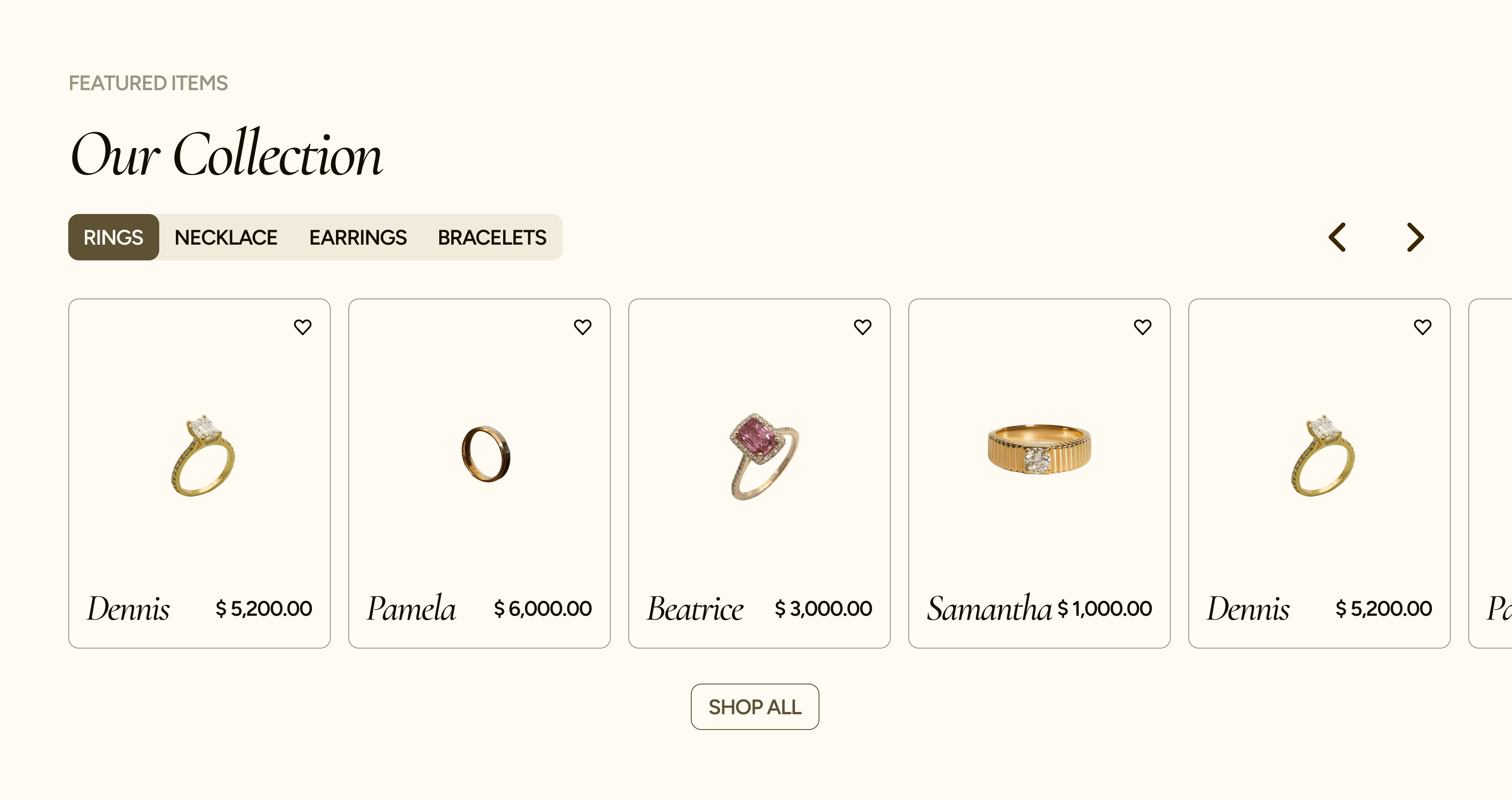
Rebuilt from a single-product placeholder into a full storytelling experience. A full-bleed hero image with a scroll-down prompt sets the tone, followed by a 'Featured Items' carousel with category tabs, editorial-style entry points to Custom and Fine Jewelry, a services snapshot, and a boutique visit section with hours and directions.
Custom Jewelry Page
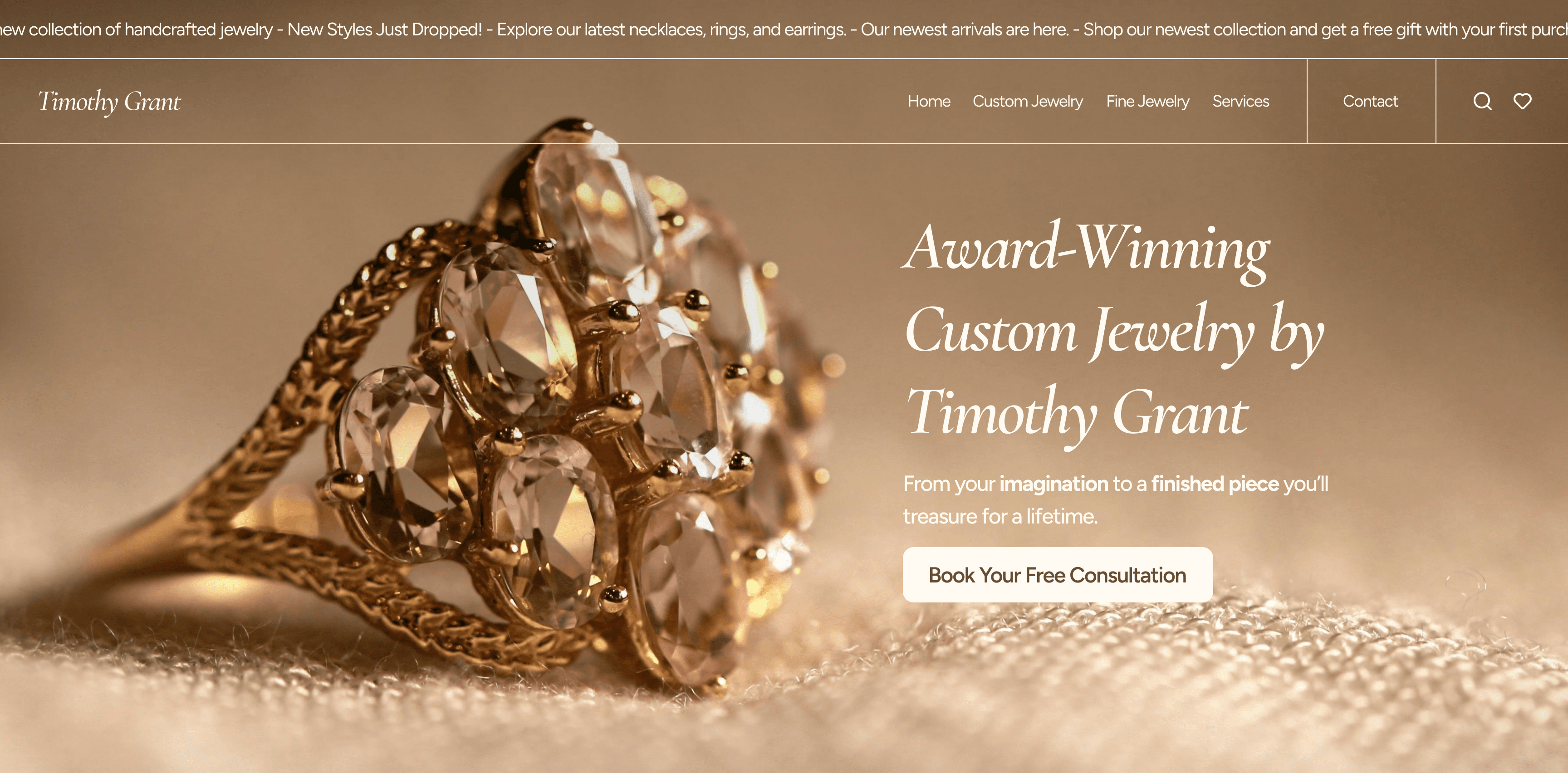
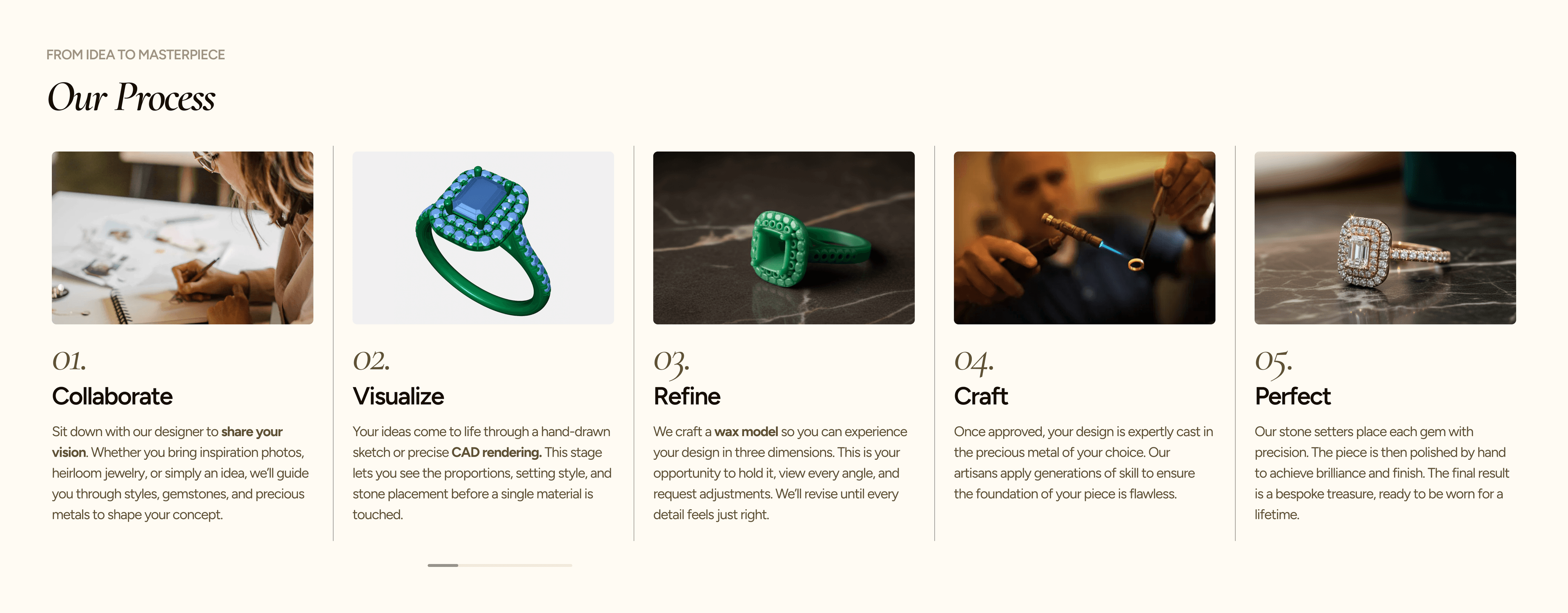
Designed to address Custom Jewelry Jane's core need: understanding the process before committing. The hero leads with "Award-Winning Custom Jewelry by Timothy Grant" and a "Book Your Free Consultation" CTA. The 4-step process is a visual walkthrough with photography and copy, followed by a secondary CTA and a filterable gallery of past custom work.
Fine Jewelry Shop
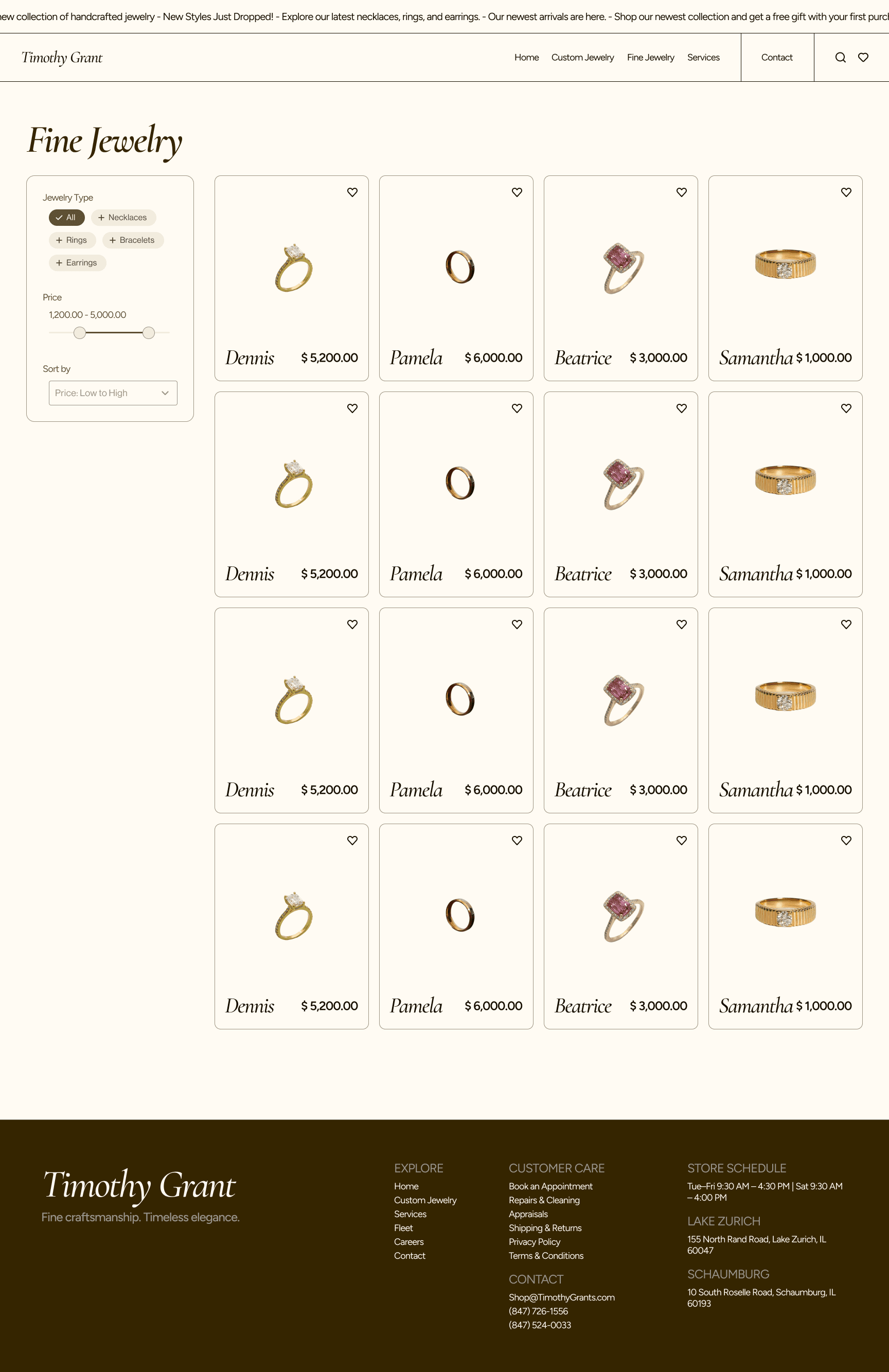
Completely restructured from brand-organized to user-organized. A left-sidebar filter panel lets users browse by jewelry type, adjust a price range slider ($1,200–$5,000), and sort results. Products display in a clean 4-column grid with consistent photography, item names, prices, and wishlist hearts, directly serving Luxury Buyer David's need to quickly find, compare, and save.
Services Page
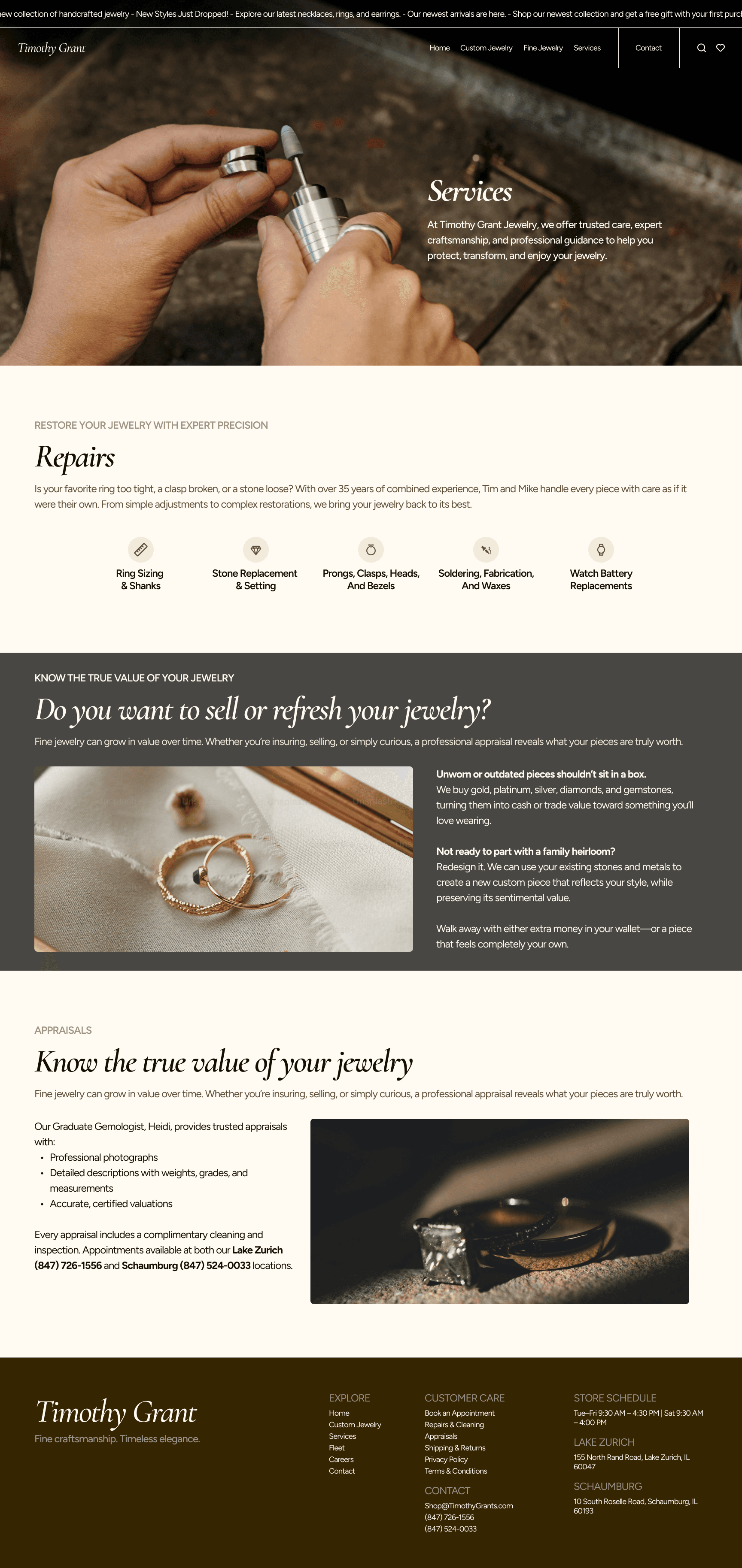
Transforms three text-heavy sections into a visually structured experience. Each service leads with credentials and specific offerings, and every section ends with a clear CTA.
Contact & Booking Page
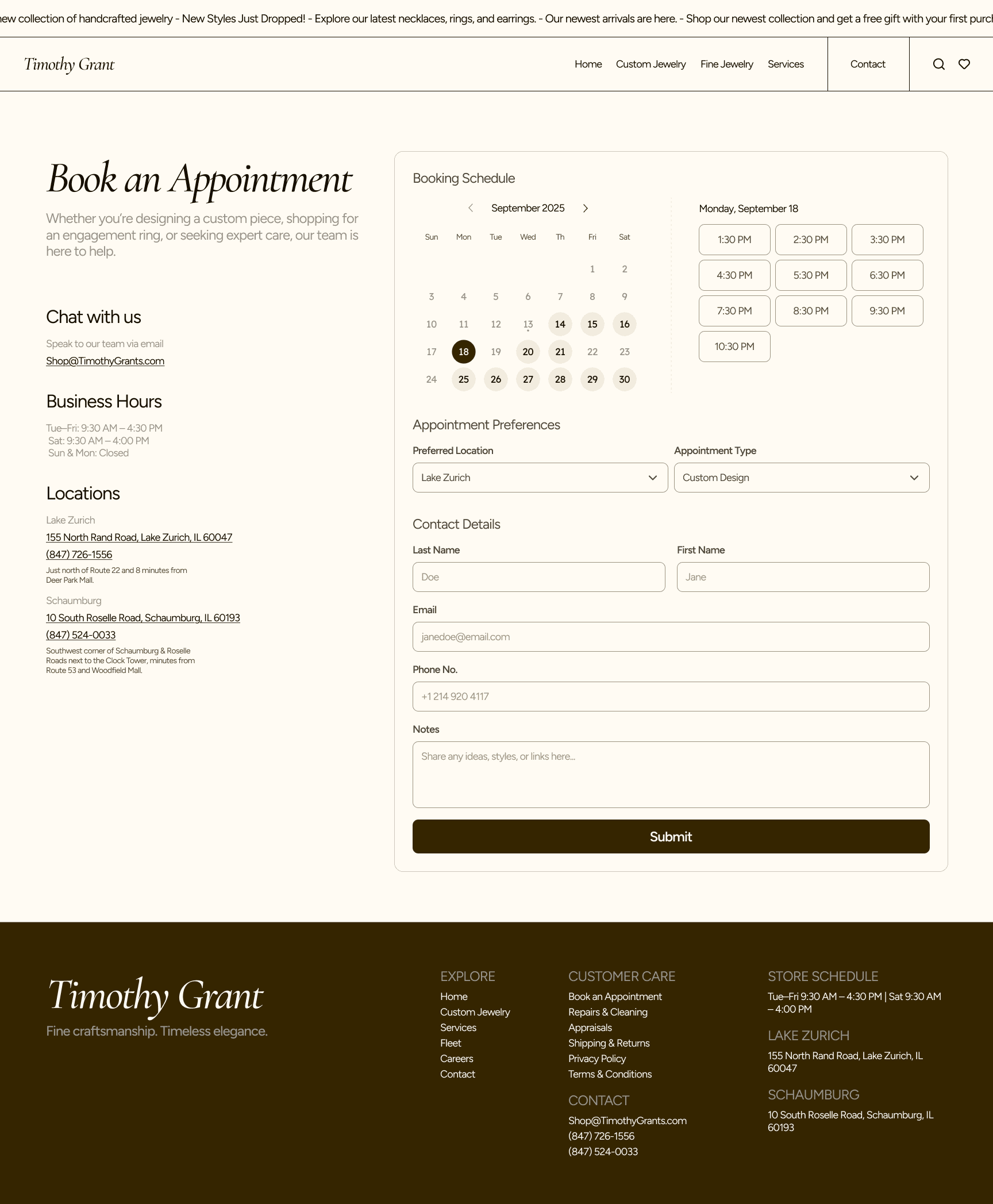
Where all three personas converge. A two-column layout: the left column provides quick-reference info (email, hours, both locations with phone and directions), while the right column houses the full booking flow: calendar date picker, time slot selection, location and appointment type dropdowns, and a contact form. This replaces the old phone-only system with 24/7 self-service lead capture.
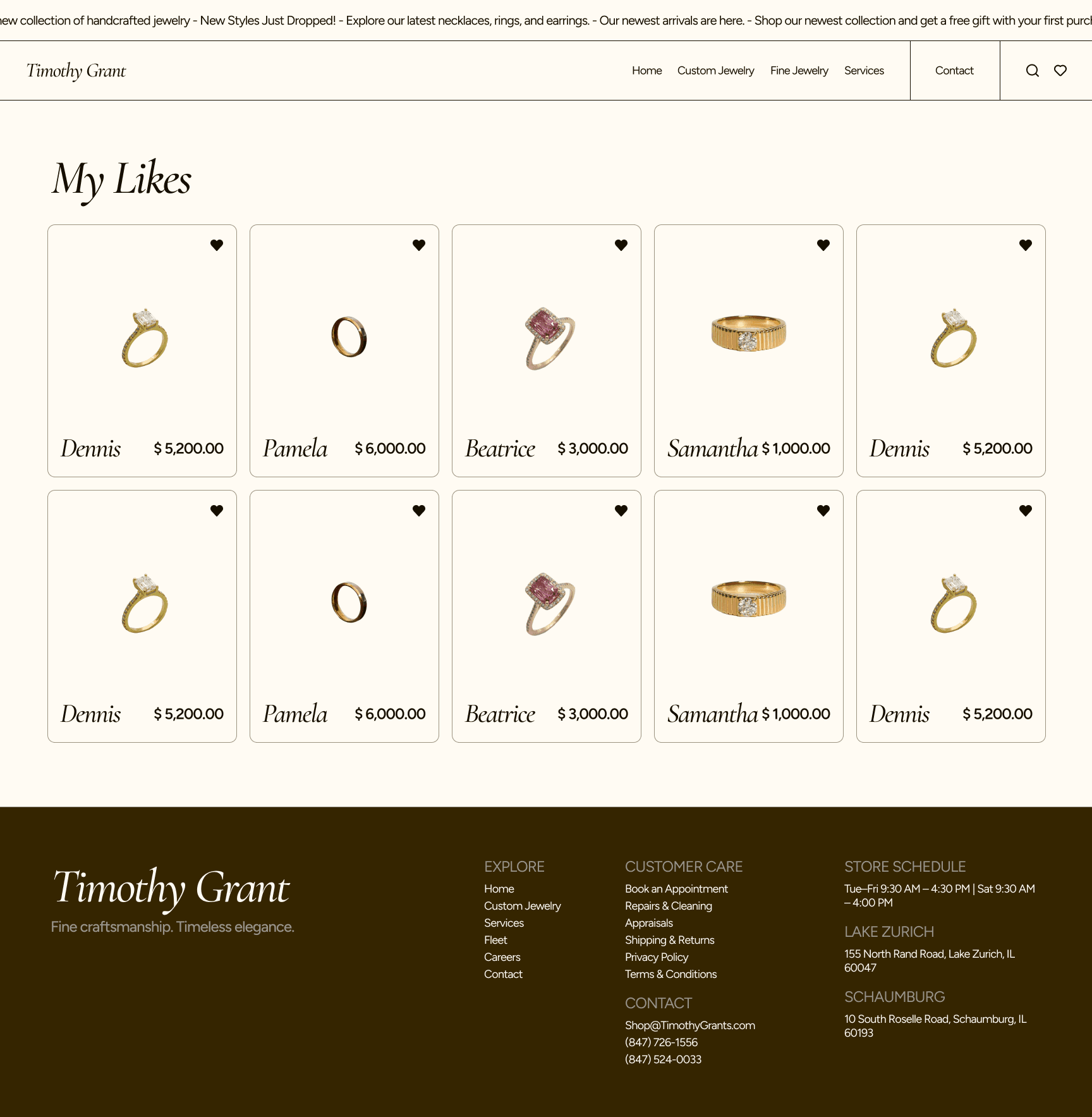
My Likes (Wishlist)
A new feature that didn't exist on the original site. Users can heart products across the shop and custom jewelry pages, then view all saved items in a dedicated grid. Serves David's 'browse and shortlist' behavior and Jane's inspiration-gathering phase, while giving the business insight into which products generate the most interest.
Results & Impact
This project is currently in progress and has not yet launched, so quantitative performance data is not yet available. The redesign was built to address specific, measurable outcomes based on the competitive gaps and user needs identified during research.
Projected impact across five key dimensions:
Retrospective & Learnings